
the secret of sums


About

just another kind of old
To quote the late Jeroen Brouwers: Niets bestaat dat niet iets anders aanraakt. (free translation: everything is part of something else). The entire known universe is made out of stardust, rearranged into a particular order. New is an illusion. Everything is a sum of other things.

This plus that
So, you too, can be incredibly original. All you need to do is take two ‘old’ things and mash them together to make something ‘new’.
alternative math
Interestingly enough, not all sums are valued equally. In some cases 1 + 1 doesn’t make 2, but 3! In other words: some combinations appear to be more than the sum of their parts. This phenomenon has both fascinated & frustrated creatives (and mathematicians) all over the planet. Is math wrong?

let’s try it out!
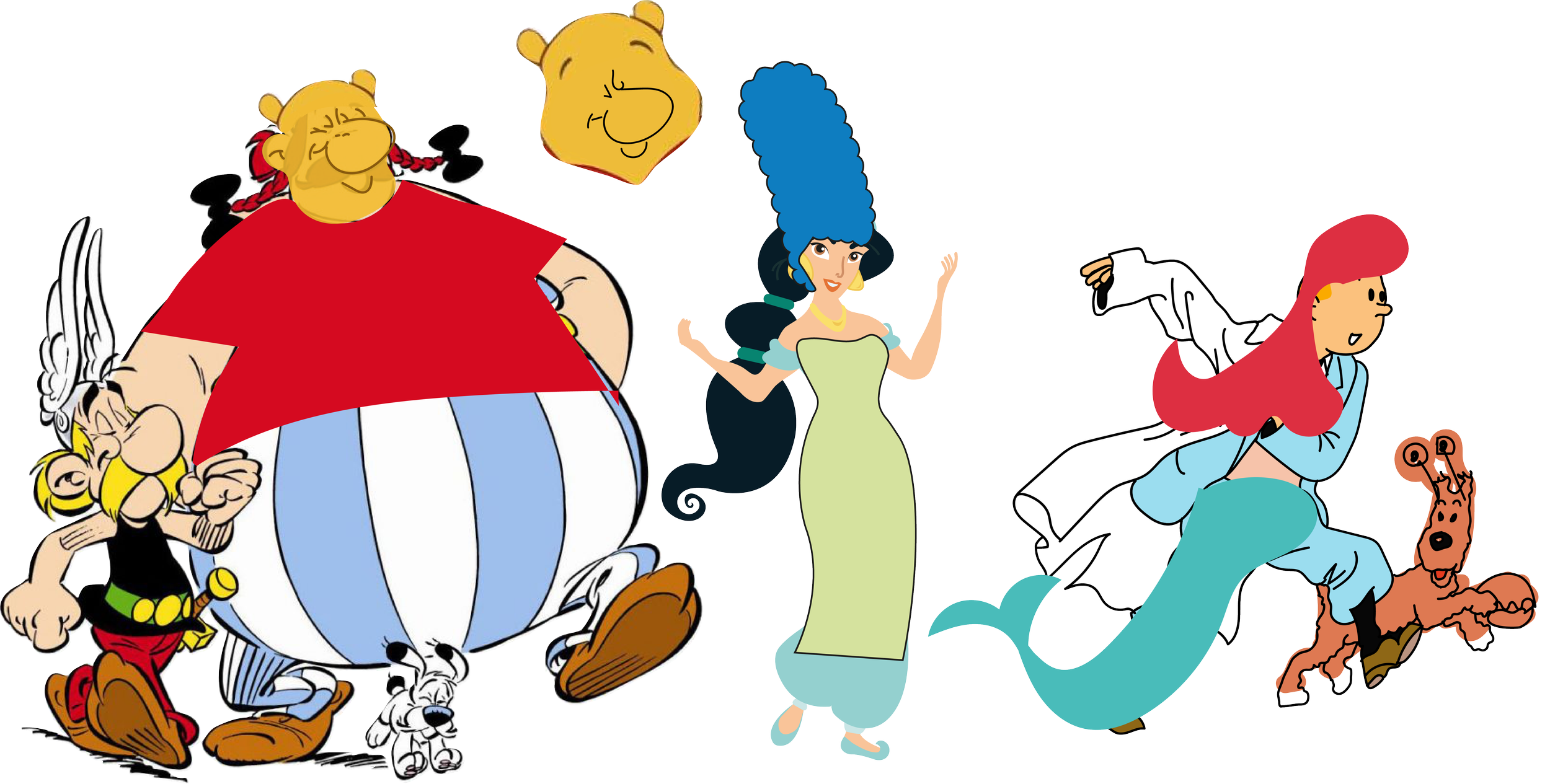
I developed a quick exercise for you. Take a famous cartoon character: such as Minnie Mouse, or Astérix, and dress them up as a different famous cartoon character (as though they were going to Comic Con). Just in your head. How many great ones can you come up with? When you get stuck, let my randomizer machine help you.
Beauty dressed up as Lisa Simpson
Difficult, isn’t it?
Sure, generating combinations may be as easy as pressing a button. But once you have to make a choice, things get more vague. Ideas in your head can only take you so far. To really judge how well combinations work, you need to test them. You can do this by sketching. Or, even easier: by making a quick collage.
Congratulations! You just found the next element we need: Doing. (“tu dois faire des choses”, as you may have seen in Lies’s part of the master’s exhibition)
Not in a creative mood? My students were so kind to make you a few examples ... Have a look! ↓↓↓


I asked around, and in doing so, we learned a few remarkable lessons:

lesson 1: tastes differ
When I asked people about their favourites, I got many different answers. I—for instance—looooved these. Especially the Over the Garden Wall + Pocahontas & Mélusine + Smurfette/ Gargamel combinations. When I asked students who didn’t choose these: why they didn’t .They replied: “I don’t know the character”. This is incredibly important. If you use symbols and codes your audience isn’t familiar with, the idea loses out on a great moment of connection. So, research your intended audience. Co-create with the community it is intended for. And don’t assume you all share one dominant (pop) culture. Or make what you like, there will always be an audience for it. Sometimes that works too.

lesson 2: don’t be too logical
Princess Fiona has a Barbie-like appearance in the first half of Shrek 1. When she ultimately becomes an ogre, she still wears her dress. Shego looks so believable in her outfit, she looks like a character from Buzz Lightyear of Star Command (especially to old people like me, who grew up Disney Festival in the 90s, well before Kim Possible). The Pink Panther, then, is just visually so far away from Lilo, he just looks like he’s on a holiday in Hawaii. If your audience ‘feels’ like they’ve seen this before, it has an effect of how they perceive your work. All 3 students who made these were top of their class—and these were good creations—only, this time they were slightly too logical. My advice: never shy away from trying the obvious, but be honest during your initial tests. If doesn’t look fresh, just try a few more things.

lesson 3: unluck exists
My students grew up with Disney Channel. That much is clear. The sheer amount of Kim Possible, or Phineas and Ferb submissions was staggering. If then, two students also have the same costume idea, on top of their similar character choice, it’s very hard nót to compare them. Usually with trends the following happens: if you’re too early, there is a bigger risk and few people will get it. (That is why the Advertising industry moves generally slower than individual Pop culture instigators and artists. Their stakes are higher.) However, the more copies of a style or idea exist, the less each individual copy is valued. Excépt, if one of them was first, and the next ones are widely understood to be copies. (That is the true meaning of originality: being the first of many. i.e. ‘thé original’.) These students were unaware of each other’s work. In student competitions with hundreds of participants, this kind of bad luck too often means defeat. Totally sucks and I feel for them.

lesson 4: form is function
The Bauhaus had this saying: ‘form follows function’. But when the function is just ‘being communication or art’, form becomes invaluable. That is why painters learn about shape language and rhythm. All the most popular creations had that in common: a similarity in shape between the character and the costume. Look how Patrick has all the makings of a baby poof with his round belly, big eyes and pink color. Look how similar the Powerpuff Girls look to Huey, Dewey & Louie (Kwik Kwek & Kwak). Look how the baggy style of Rocket Power compliments the clothes Ash wears in Pokémon. So, when you’re combining visuals, try looking for visual similarities.

Lesson 5: leave a gap
The way Brian (Griffin) looks to Stewie (Griffin) says it all: “here’s another nice mess you got me into.” Tasmanian—Taz—Devil who dresses like Donald Duck is probably up to no good. Images tell stories. Especially when there are multiple characters involved. If you leave some part of that story slightly open, the audience can make the rest up themselves and they get warm fuzzy feelings about how creative théy are. Andrew Stanton, the director of Wall-E and Finding Nemo, said about this: “the audience actually wants to work for their meal, they just don’t want to know that they’re doing that”. In my experience these small details we pick up on, are difficult to manufacture. They’re usually ‘happy accidents’ you find, instead of making. My advice: experiment with an open mind and you’ll find cooler stuff than your logical mind can produce.

Lesson 6: do thís
There was one image that really immediately stood out. When its maker showed to the rest of the class, you could hear silent swears popping up all over the classroom. He hadn’t even made Patrick at this point. That “damn I wish I had done that” feeling that haunts creatives (and their Directors) for months, is the kind of jackpot we’re all after. Jef, if you’re reading this. I think you are a genius. But what makes this particular. combination so strong? What can we learn from it? Let’s see … It has both the subtext, ánd the shape similarity. It is entirely non-logical. With Jommeke he uses IP nobody else even considered, yet everybody knows. It ticks all the boxes. (except the first one, outside Flanders, Jommeke is relatively unknown.) But the one formula I’d like you to take away from this is: similar in shape, opposite in meaning. Squidwards looks sarcastic and cynical, Jommeke is happiness personified. His characteristic head compliments Jommeke’s iconic hairdo, and even the clothes match his style. Patrick is, to put it mildly, an idiot. The pose Jef chose emphasises this. Yet somehow, his shape, colour, and pose are also reminiscent of the brilliant Professor Gobelijn having a confused moment of epiphany.
So: similar in shape, opposite in meaning. This simple pattern, lies at the core of many great ideas. We see it in memorable puns, memes, story plot twists, ads, cartoons, designs, comedy routines, song lyrics, … everywhere. So, if you want to train your mind in finding it, go look for it in existing pop culture and art . You’ll be amazed. Or don’t. Your choice.